Type
Enterprise Software
Format
Desktop
Area
UX Research; Strategy; UX Design
Employer
ÄKTA
Digital Transformation In Auto Insurance
Digital Transformation In Auto Insurance
Digital Transformation In Auto Insurance
Digital Transformation In Auto Insurance
Type
Type
Type
Enterprise Software
Enterprise Software
Enterprise Software
Format
Format
Format
Desktop
Desktop
Desktop
Area
Area
Area
UX Research; Strategy; UX Design
UX Research; Strategy; UX Design
UX Research; Strategy; UX Design
Employer
Employer
Employer
ÄKTA
ÄKTA
ÄKTA


Modernizing Automobile Arbitration
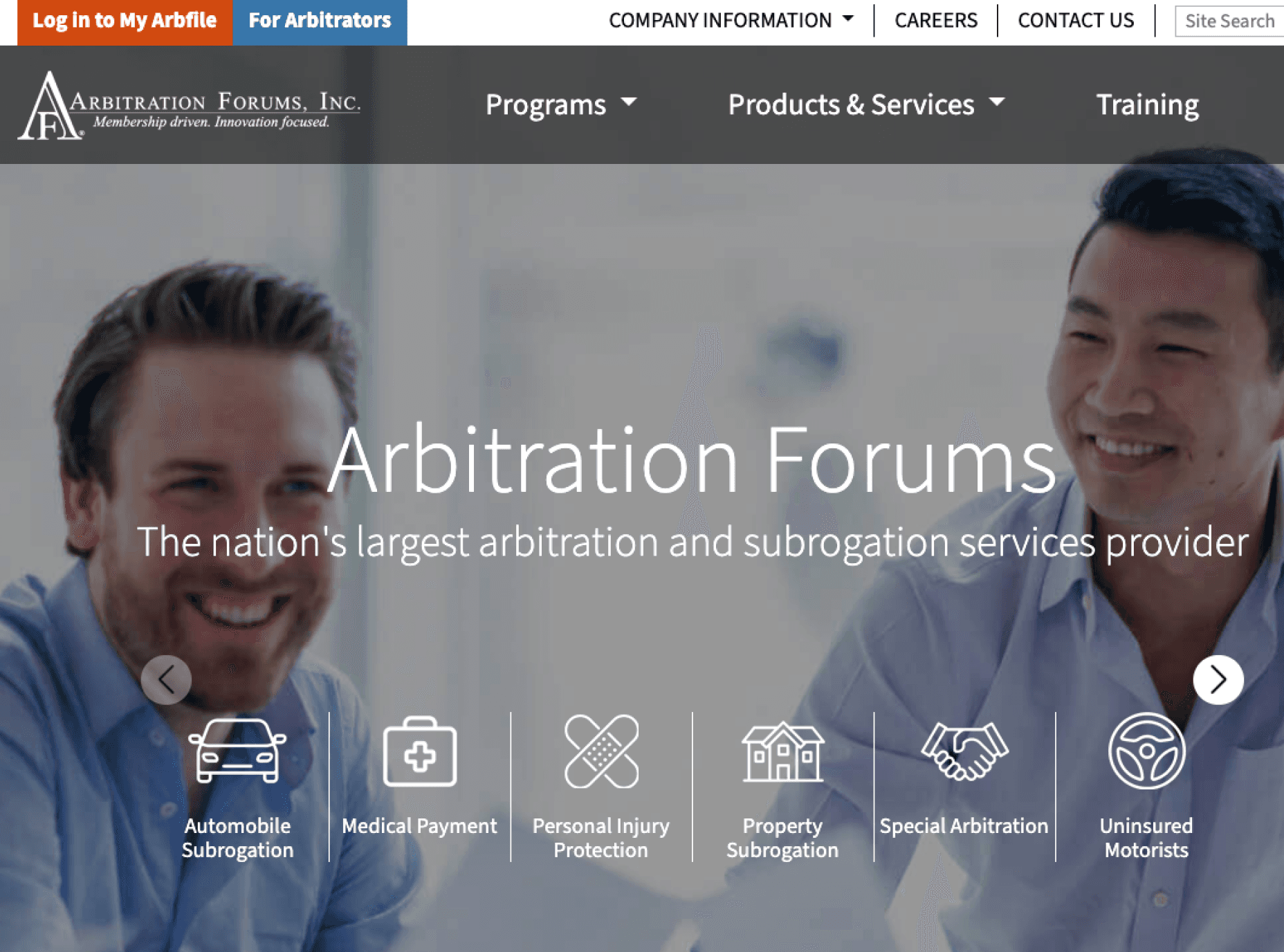
When 2 or more people get into an accident and the insurance companies can’t agree on who’s at fault, they enter into arbitration with the arbitrator supplied by an objective third insurer. Arbitration Forums is a non-profit entity that manages Arbfile, a web app that’s used by over 5,400 companies to process over 1 million disputes annually.
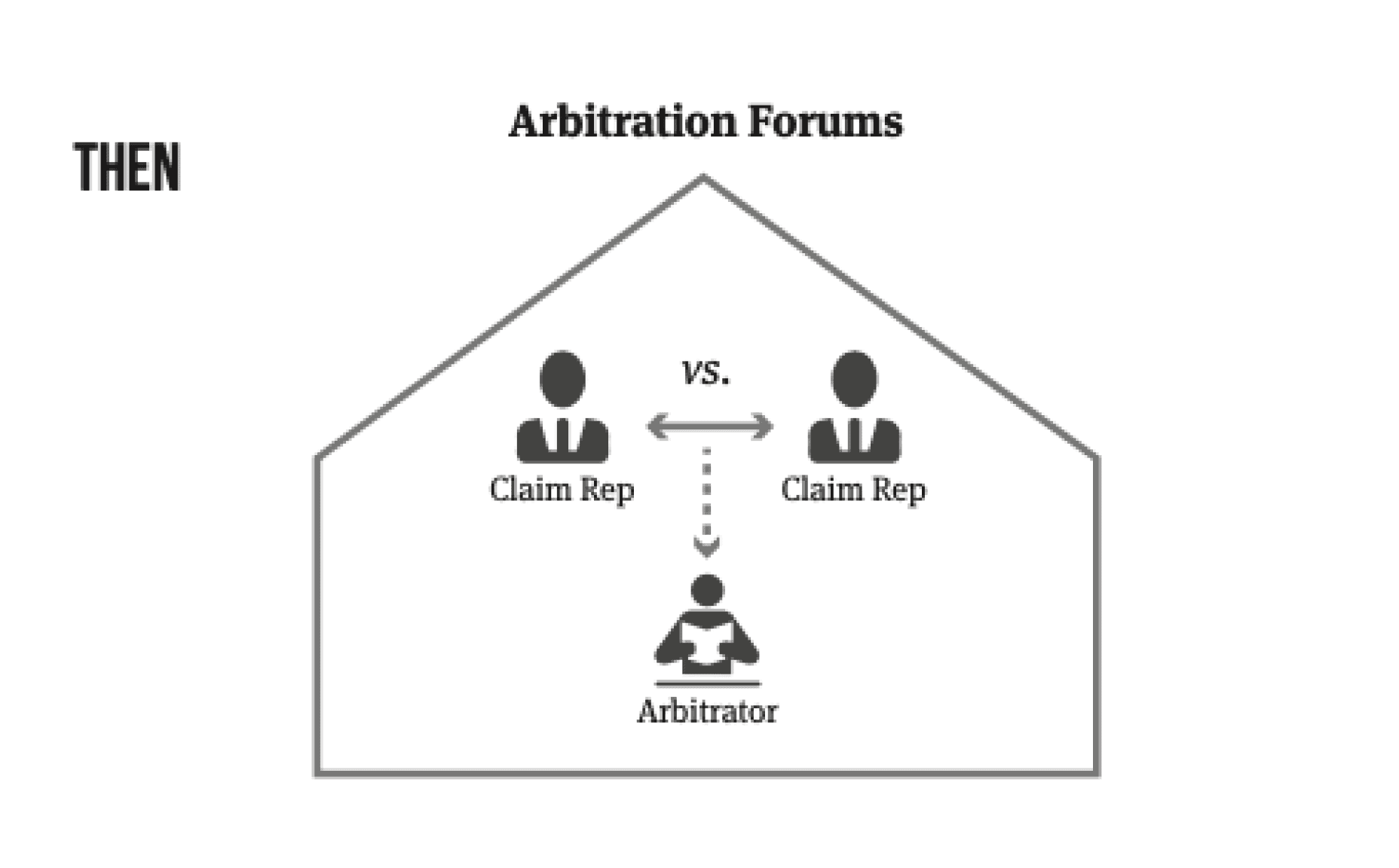
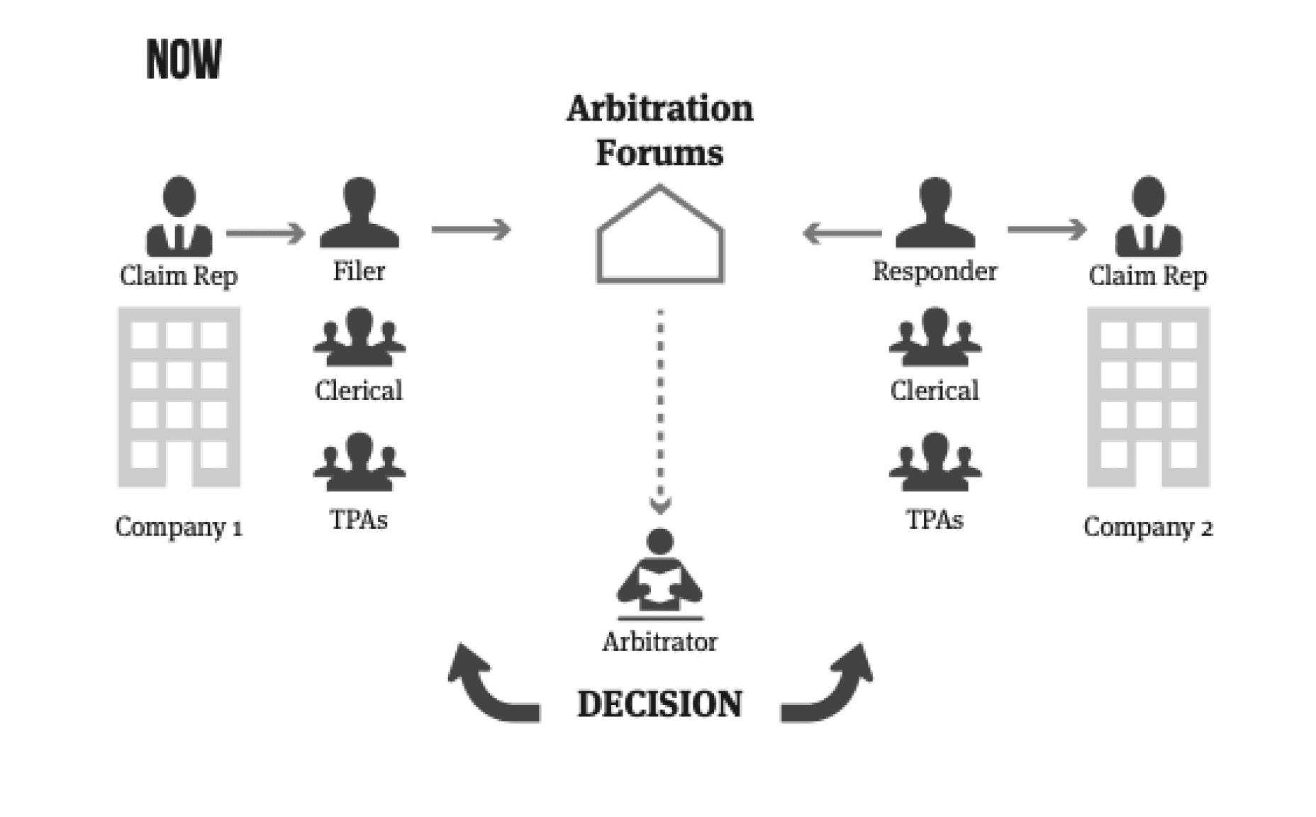
Historically the process had claimants, defending parties, and arbitrators meet in person to settle disputes. In the early 2000s this was shortened by moving the majority of cases online, but filing and defending claims was still based on a paper process.
Our role was to apply user-centered design to improve the experience for users while reducing filing time and errors.
Bringing Clarity to the Process
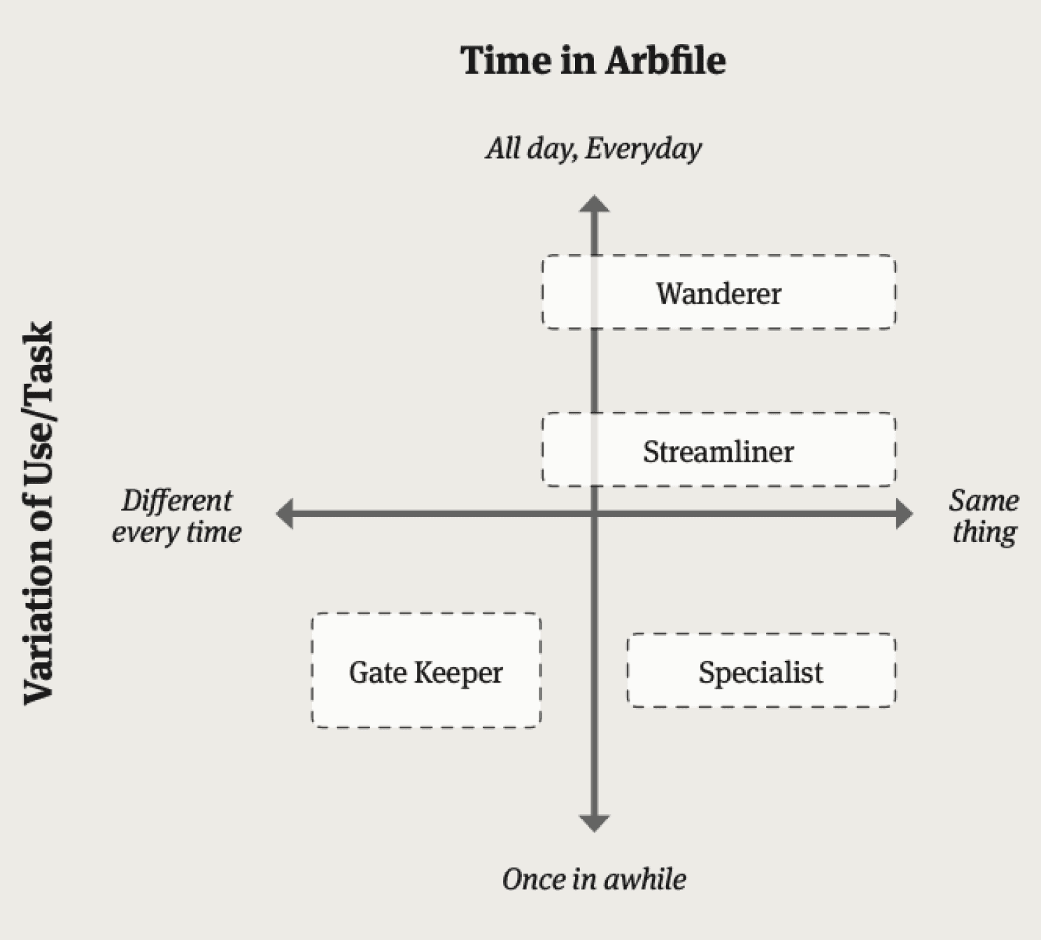
Journey maps highlighted challenges and pain points users had throughout the entire process, not just within the application itself. Participants were distilled to personas that highlighted how they used the system, allowing us to create solutions for a spectrum of users.

Insights to Interfaces
As the project progressed, I shifted to a design role. Under the UX lead, I created initial concepts and detailed wireframes based on the the needs identified in user research.
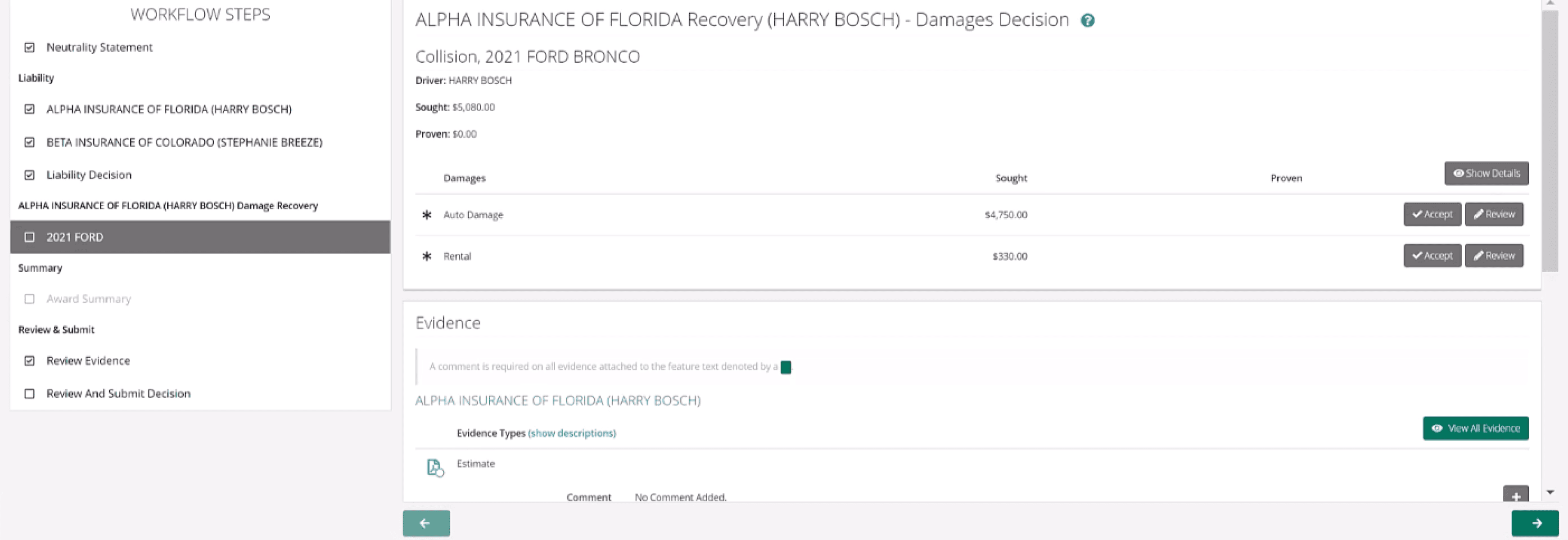
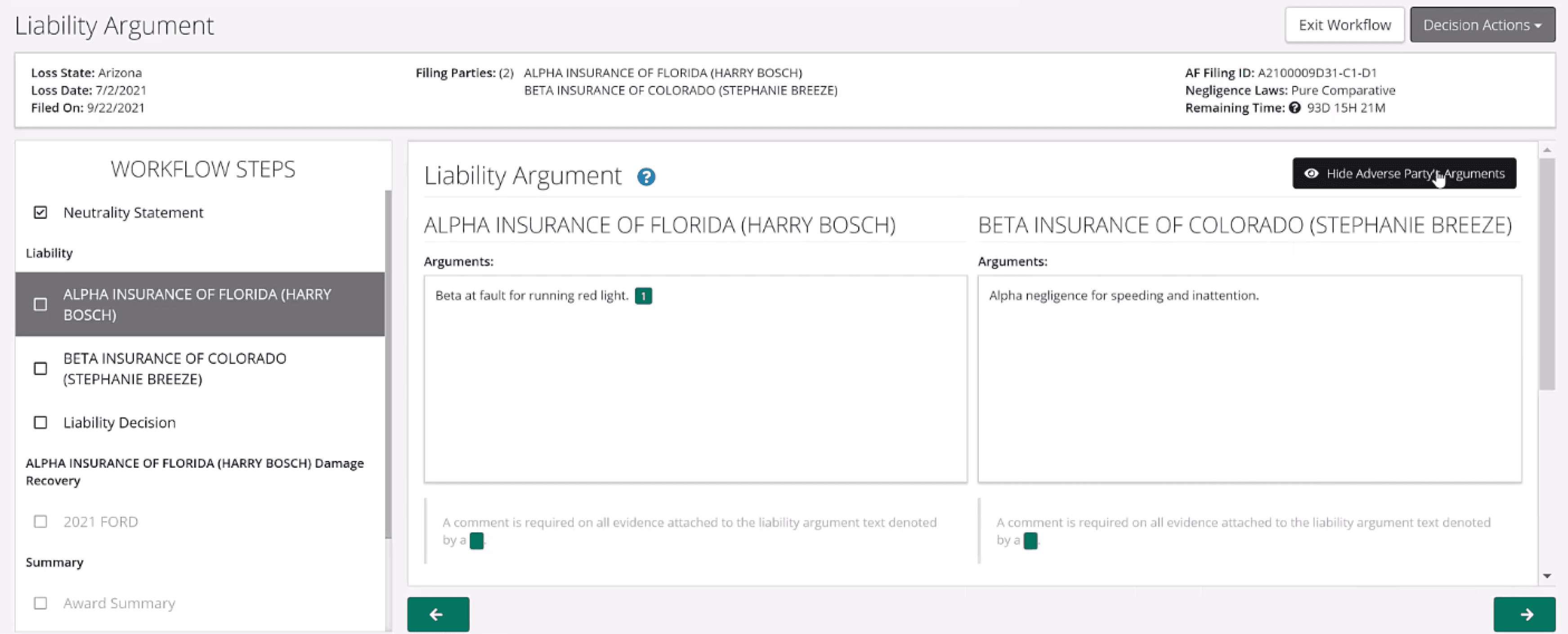
The existing UI relied on the user to manage multiple tabs and windows when reviewing evidence. This slowed the users down and also led to wrong decisions that were ultimately legally binding. For example, an arbitrator may need to view 20-30 photos of an accident. the current system opened each in its own window, causing arbitrators to miss evidence or apply evidence from one case to an unrelated case.
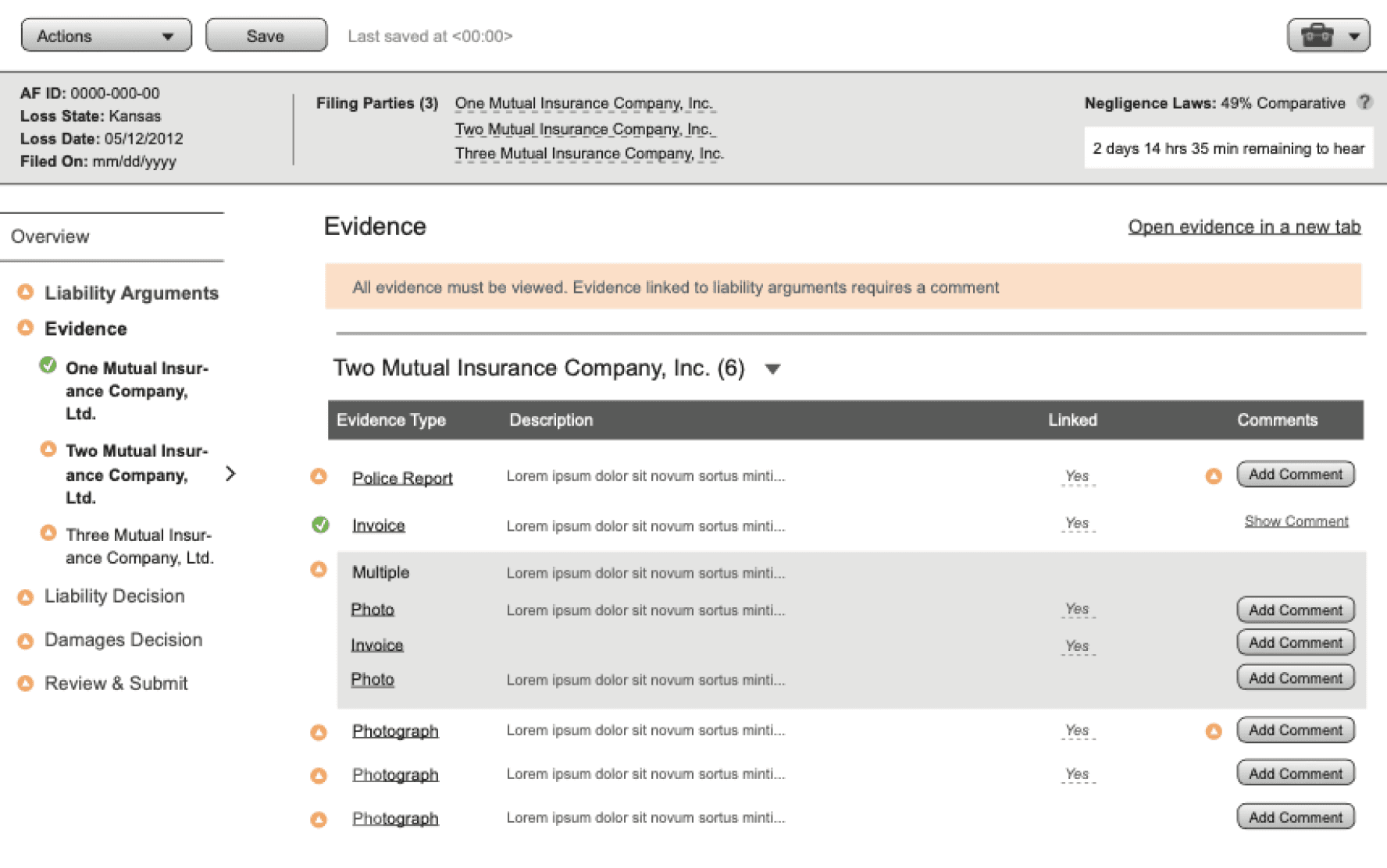
Arbitrators needed better ways to keep track of the evidence parties used to make their case. An argument held no merit without it. We focused the UI around evidence collection, analysis, and review to allow users to build their case around it and make sure it was seen by arbitrators.
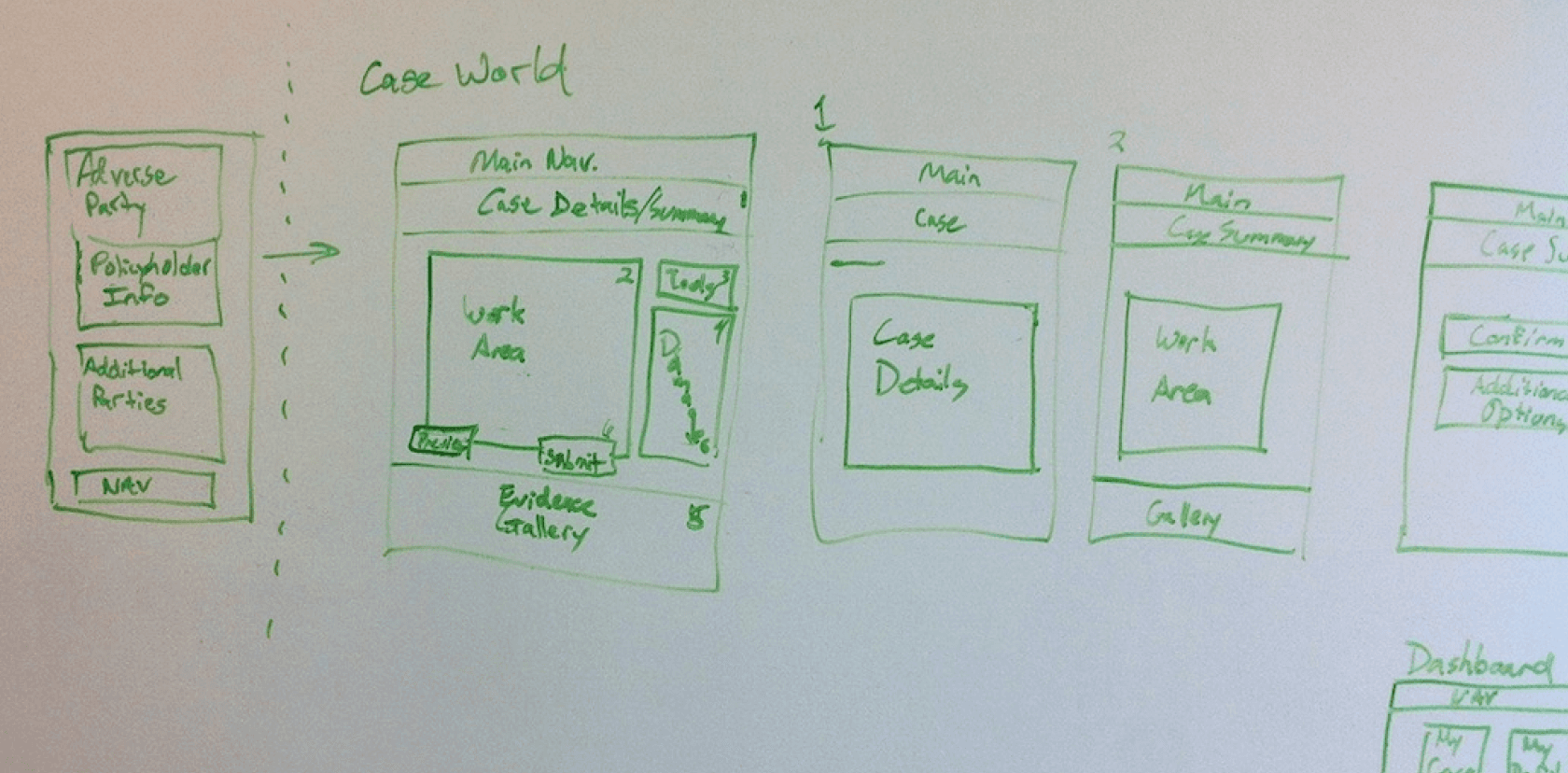

Initial concept sketches
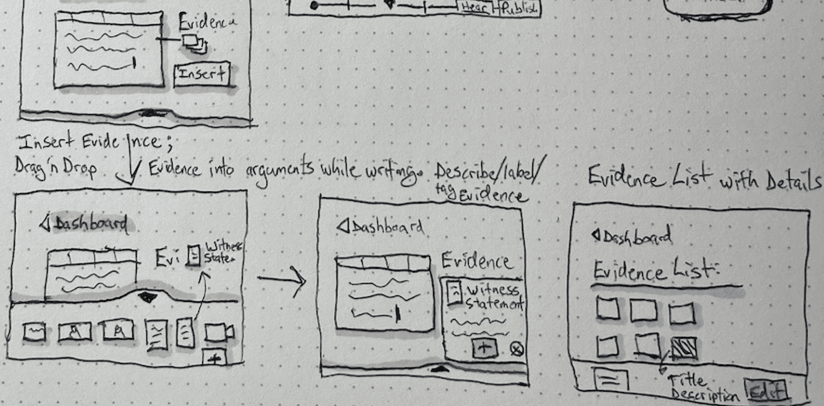

Further refinement of the evidence-centered UI
Understand User Challenges
As the UX research lead, I worked with 2 of the product owners to identify member companies to conduct research with. The companies were chosen to represent the various sizes and case volume a they could have.
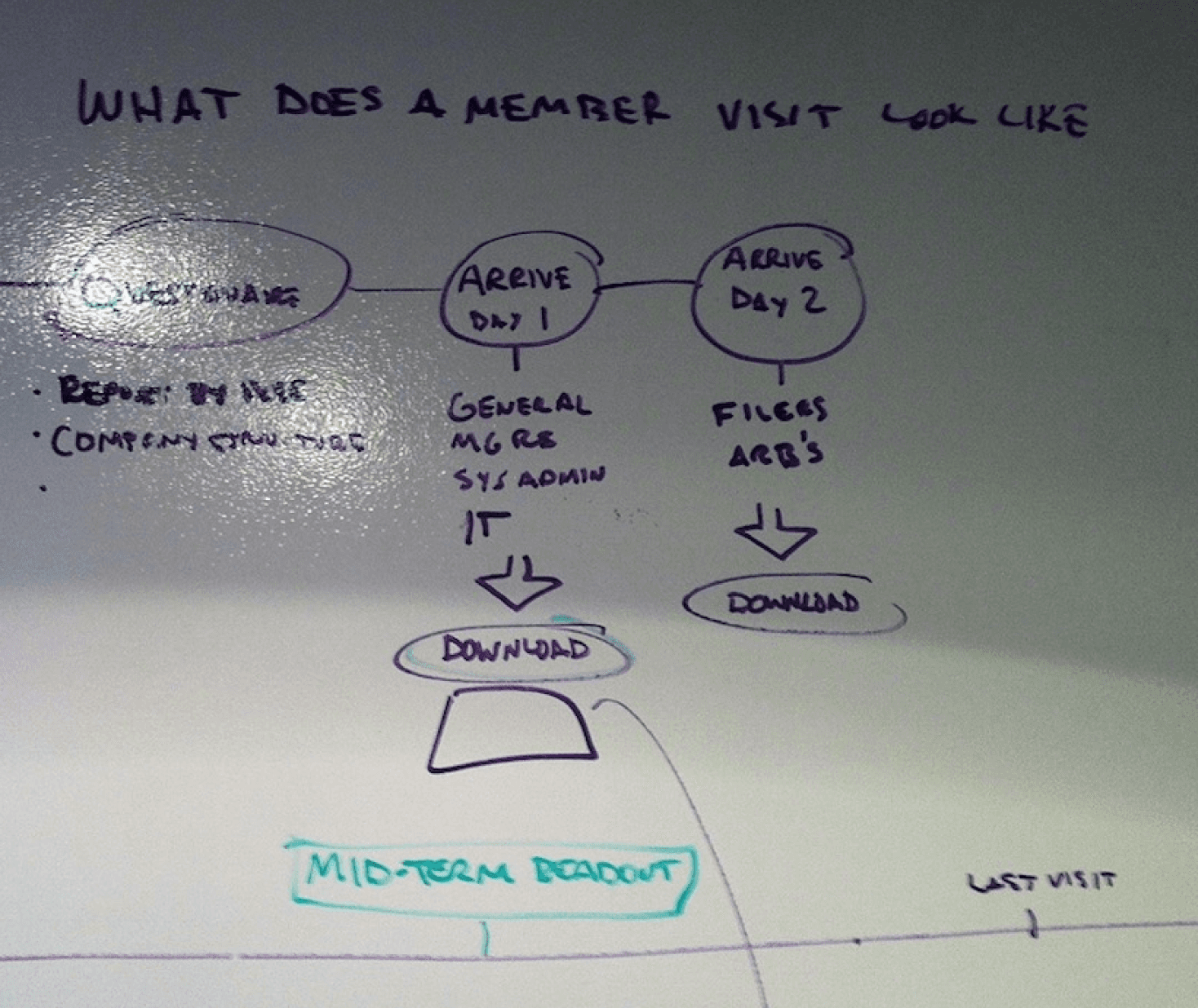

I coordinated the research and communicated with member companies to prepare for 8 site visits.
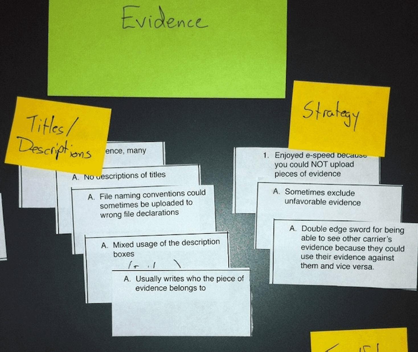

Thus began the process of analyzing the data and crafting the outputs to communicate the findings.
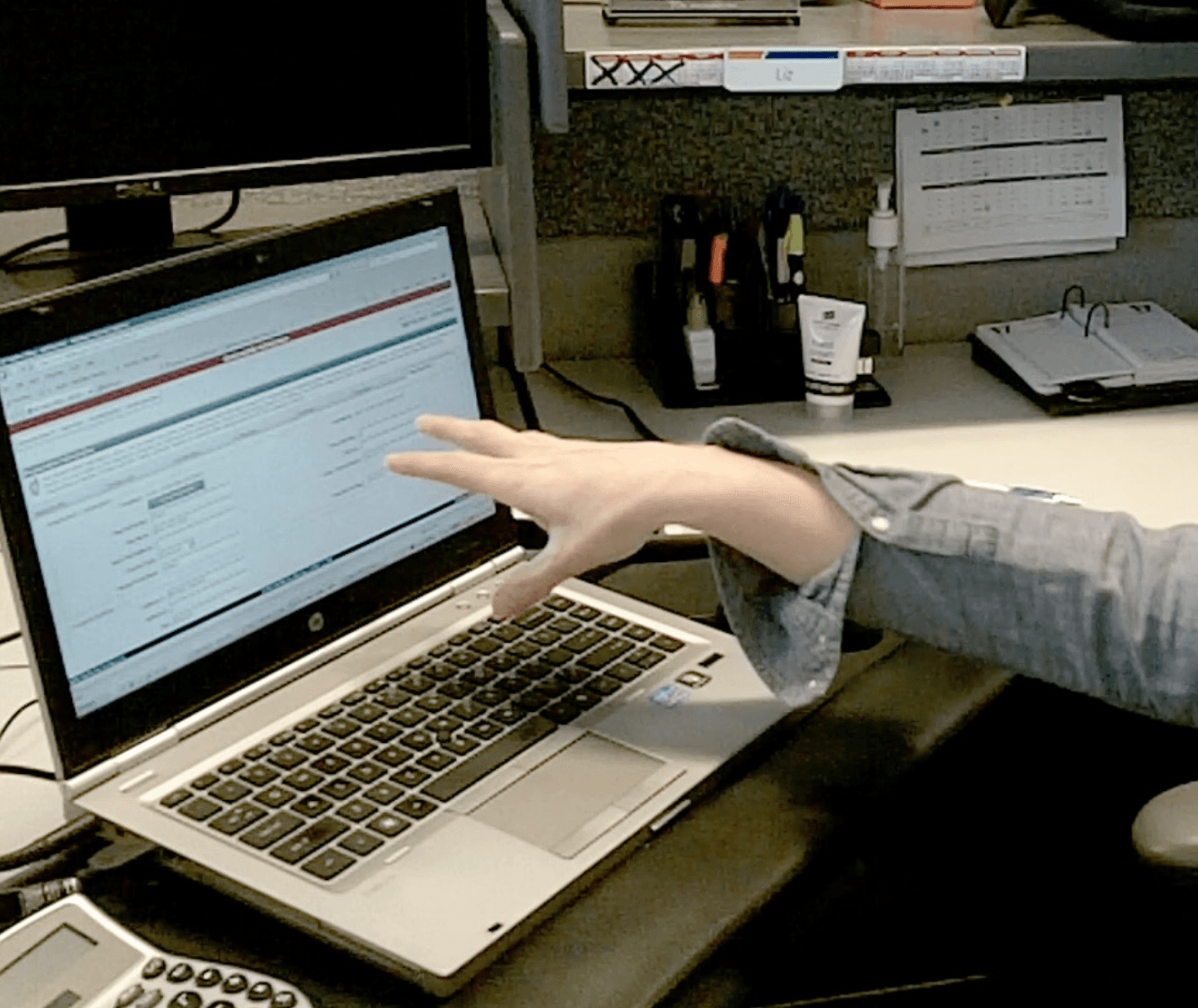

Research was completed over the course of 6 weeks and comprised over 60 in-depth-interviews with end users and their managers.



Insights to Interfaces
As the project progressed, I shifted to a design role. Under the UX lead, I created initial concepts and detailed wireframes based on the the needs identified in user research.
The existing UI relied on the user to manage multiple tabs and windows when reviewing evidence. This slowed the users down and also led to wrong decisions that were ultimately legally binding. For example, an arbitrator may need to view 20-30 photos of an accident. the current system opened each in its own window, causing arbitrators to miss evidence or apply evidence from one case to an unrelated case.
Arbitrators needed better ways to keep track of the evidence parties used to make their case. An argument held no merit without it. We focused the UI around evidence collection, analysis, and review to allow users to build their case around it and make sure it was seen by arbitrators.

Initial concept sketches

Further refinement of the evidence-centered UI
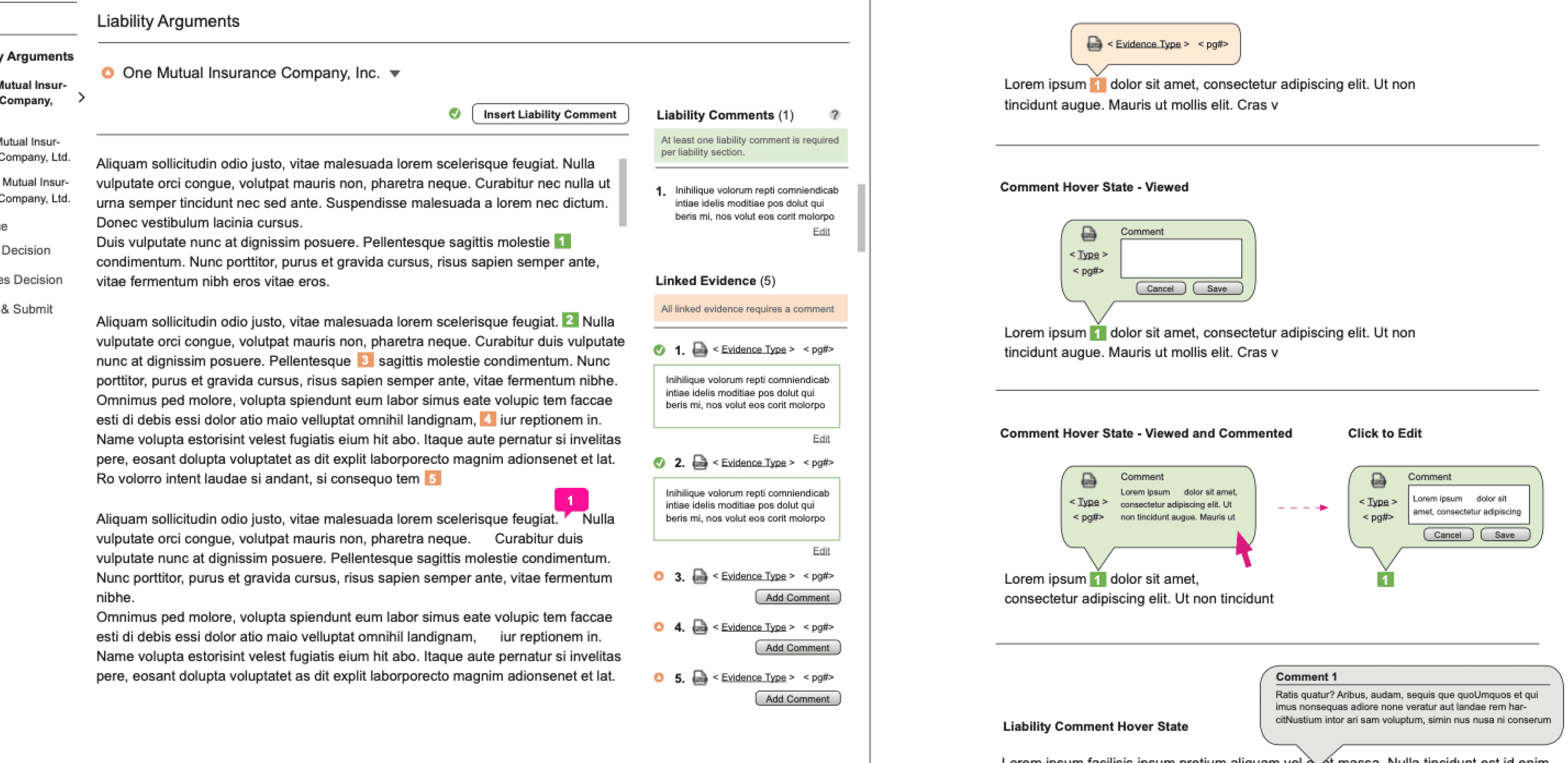
Detailed wireframes
Implementation and Results
We were able to create an experience that was easier to use and increase customer satisfaction. In addition, our research helped inform and change existing policies. Parties were able to view all evidence being used against them, arbitrators had guidance for how to apply policies in their decisions without navigating away from their cases, and member companies had an audit trail and peace of mind knowing their evidence was viewed and cases were decided based on that evidence--not a persuasively worded essay.



Policy Change
My proudest achievement however, is that our research led to policy changes that affect all parties and make the experience better for the end users. As researchers and designers, our goal is to make a positive impact, and it was great knowing we were able to improve the experience of thousands of people.


Understand User Challenges
As the UX research lead, I worked with 2 of the product owners to identify member companies to conduct research with. The companies were chosen to represent the various sizes and case volume a they could have.


I coordinated the research and communicated with member companies to prepare for 8 site visits.


Thus began the process of analyzing the data and crafting the outputs to communicate the findings.


Research was completed over the course of 6 weeks and comprised over 60 in-depth-interviews with end users and their managers.
Bringing Clarity to the Process
Journey maps highlighted challenges and pain points users had throughout the entire process, not just within the application itself. Participants were distilled to personas that highlighted how they used the system, allowing us to create solutions for a spectrum of users.


Insights to Interfaces
As the project progressed, I shifted to a design role. Under the UX lead, I created initial concepts and detailed wireframes based on the the needs identified in user research.
The existing UI relied on the user to manage multiple tabs and windows when reviewing evidence. This slowed the users down and also led to wrong decisions that were ultimately legally binding. For example, an arbitrator may need to view 20-30 photos of an accident. the current system opened each in its own window, causing arbitrators to miss evidence or apply evidence from one case to an unrelated case.
Arbitrators needed better ways to keep track of the evidence parties used to make their case. An argument held no merit without it. We focused the UI around evidence collection, analysis, and review to allow users to build their case around it and make sure it was seen by arbitrators.


Initial concept sketches


Further refinement of the evidence-centered UI


Detailed wireframes
Implementation and Results
We were able to create an experience that was easier to use and increase customer satisfaction. In addition, our research helped inform and change existing policies. Parties were able to view all evidence being used against them, arbitrators had guidance for how to apply policies in their decisions without navigating away from their cases, and member companies had an audit trail and peace of mind knowing their evidence was viewed and cases were decided based on that evidence--not a persuasively worded essay.


Policy Change
My proudest achievement however, is that our research led to policy changes that affect all parties and make the experience better for the end users. As researchers and designers, our goal is to make a positive impact, and it was great knowing we were able to improve the experience of thousands of people.